
The other day at a client meeting we were discussing Pareto and the concept that 80% of the revenues were generated by 20% of the customers and It was likely that 80% of profit was generated from them as well. Management was having a difficult time picturing this, but fortunately we had prepared for this meeting by using the Excel Data Analysis add-in.
The first graph we presented was the histogram of revenues generated by their clients.

The most telling thing for management was that 40 of their customers generated less than $1,000 of revenue. And notice how many generated under $15K in revenue. Suddenly, they could see new patterns by changing the visualization. So, if you haven’t tried to graph this yet using data analysis, here are steps to consider.
First, create a table with the information you want to chart. In this case it was the customer and revenues for 2018. Next, in your Excel, click on Data Analysis and the following modal box pops up:
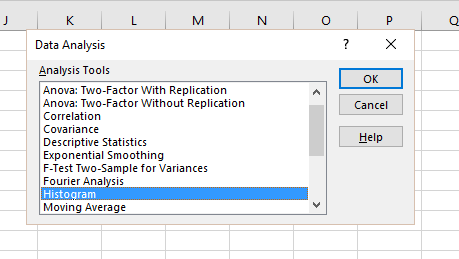
Select histogram. It then advances to the next pop-up which asks for the data range and the Bin Range. A little bit about the bin range: It is the breakpoints you want to use to group your information. In this case, I ran a filter to determine the largest amount and set the bin increment just above it. In this case, we want to see the Pareto effect, so click on the Pareto (sorted histogram) box and also the Cumulative Percentage box. And then chart the output.

Click OK.

After Excel generates the histogram table file and graph, you may need to make some modifications to get the graph to look the way you want. In this case, I wanted to sort by revenue impact of the various bins. To do that, I multiplied the frequency by the bin amount and then sorted the table file by the total bin revenue generated. Finally, I added a calculated percentage for each bin and the cumulative percentage. I then set the Cumulative Percentage to use the new percentage I calculated. In this case, The impact of sales between $15,000 and $25,000 account for almost 80% of revenues, even though their frequency is less than 15%.
Consider the impact that this type of presentation can have on a strategic conversation. What does your staffing level look like if we focused our energy on that small group of customers? What message resonates best with that group? Should we discontinue sales to small buyers? We had a great conversation from less than an two hours worth of work – mostly spent in defining the table structure, gathering the data and importing it.
Raw data and numbers are useful in the right context, but if you want to stimulate an effective business meeting, show some graphs which group data in ways that make your team think about what they are doing and why.