Using Excel More Effectively

I was asked a question last week about Excel and how we manage all the calculations we have going on.  Doesn’t it get confusing when you can’t recall what cell BalSht!AA192 represents?

Well, we hardly ever have that problem.  We use two distinct methods to help control our Excel programmatic flows:

  • Cell Naming
  • Data and Calculation sheets

excelexamplenaming1

In today’s example, I set up a very simple payment calculation worksheet.  Here you can see where I begin naming cells; in this case I have named B7 PerPayments, which I am using as short-hand for periodic payments.  But in the function wizard, you can see where I named the cell for the Rate = APR, the NPer as Years and Pv as PresentVal.  These correspond to B2, B3 and B4.

We set it up this way for two reasons – first and foremost, we try not to create new workbooks.  We have standard templates which we use and turn over to clients to use.  To make everyone’s life more hassle-free, we think that making it easier to follow the logic makes sense.  The second is that, in some of our work, the process is incredibly involved and trying to go back to a particular sheet and cell can be time-consuming and often leads to grabbing the wrong input.  Naming eliminates both the fog of not understanding and typing in the wrong cell reference.

namemanager1

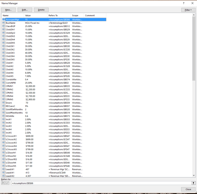
Above is a partial list of the names we have running in our projections workbook.  There are almost 200 named cells; almost all of which come from the data page we named assumptions.   Each of these names actually helps us with some basic calculation on one of the other calc sheets.  Organizing our work this way makes it easy for us to navigate through the workbook and even copy sheets with the formulae intact.

Below is what our assumptions page looks like.  Currently we have about 85 lines in 9 sections covering about 400 variables which provide the static data we want to evaluate.

assumptionspg1

ClickDYr4 represents cell E29.  We reference ClickDYr4 in about 12 calculations on both the sales and marketing calculations sheets.  When we need to update the variable, we simply return to the assumptions page, go to the correct cell and enter it.  If we are not sure, we can go to the name manager and look it up.

It also makes formula creation much simpler. namingexcel2

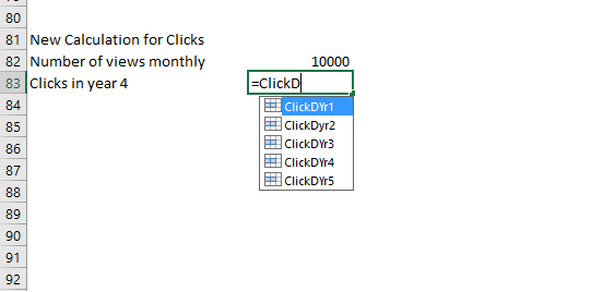
Naming allows you to simply start typing, instead of using your mouse to jump to the page where you have stored your variable, click on the cell and then hit enter.  It can speed up your work and help you make sure you have important calculations documented.

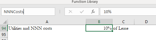
So, how do you name a cell?  This is super easy.  In the box above Column A it shows the current cell reference.  In this case it is referencing B94, which we have defined in column A as Utilities and triple net costs.

namingexcel3

Click in the box and then type the name you want.  We are naming it NNNCosts for our workbook.

namingexcel4.png

Hit enter.  Now it is named.  You can then reference it anywhere in the workbook.  In our case, we have a facilities calculation worksheet which manages the outflows for facilities in our projection.

namingexcel5

There it is, ready to be used in your calculations.  It is much easier to follow than what was originally there; =D4*Assumptions!$B$94.

By following these simply and easy to follow rules, you will make your workbooks more reusable and user-friendly.  This will make your work in expanding your workbooks easier and also make your work that much more effective.  Your team and clients – if you hand your workbooks off to others – will thank you.


A little Excel Excitement

The other day at a client meeting we were discussing Pareto and the concept that 80% of the revenues were generated by 20% of the customers and It was likely that 80% of profit was generated from them as well.  Management was having a difficult time picturing this, but fortunately we had prepared for this meeting by using the Excel Data Analysis add-in.

The first graph we presented was the histogram of revenues generated by their clients.

histogram1

The most telling thing for management was that 40 of their customers generated less than $1,000 of revenue.  And notice how many generated under $15K in revenue.  Suddenly, they could see new patterns by changing the visualization.  So, if you haven’t tried to graph this yet using data analysis, here are steps to consider.

First, create a table with the information you want to chart.  In this case it was the customer and revenues for 2018.  Next, in your Excel, click on Data Analysis and the following modal box pops up:

histogram2

Select histogram.  It then advances to the next pop-up which asks for the data range and the Bin Range.  A little bit about the bin range:  It is the breakpoints you want to use to group your information.  In this case, I ran a filter to determine the largest amount and set the bin increment just above it.  In this case, we want to see the Pareto effect, so click on the Pareto (sorted histogram) box and also the Cumulative Percentage box.  And then chart the output.

histogram5.png

Click OK.

histogram8

After Excel generates the histogram table file and graph, you may need to make some modifications to get the graph to look the way you want.  In this case, I wanted to sort by revenue impact of the various bins.  To do that, I multiplied the frequency by the bin amount and then sorted the table file by the total bin revenue generated.  Finally, I added a calculated percentage for each bin and the cumulative percentage.  I then set the Cumulative Percentage to use the new percentage I calculated. In this case, The impact of sales between $15,000 and $25,000 account for almost 80% of revenues, even though their frequency is less than 15%.

Consider the impact that this type of presentation can have on a strategic conversation.  What does your staffing level look like if we focused our energy on that small group of customers?  What message resonates best with that group?  Should we discontinue sales to small buyers?  We had a great conversation from less than an two hours worth of work – mostly spent in defining the table structure, gathering the data and importing it.

Raw data and numbers are useful in the right context, but if you want to stimulate an effective business meeting, show some graphs which group data in ways that make your team think about what they are doing and why.


Understanding cost drivers

A few years back, I was brought in by the president of a small business which manufactured and installed custom storage systems for offices and restaurants.  His concern was that either his accounting system had a bug in it or that someone was stealing from him.

This came to light when he ran his most recent quarter profit and loss; it seems that for the first time in over 7 years, he lost money.  His shop has never been busier.  He is getting lots of highly profitable contracts so the quarterly results don’t make any sense.  I asked to see quarterly information and got to work.

The first report I reviewed was the profit and loss report.  Sure enough, there was a $53K unabsorbed overhead amount  This happens in one of two ways – quarterly overhead went through the roof or the driver, in this case direct labor hours, were substantially lower.  Sure enough, the direct labor hours were down about 10%, indicating that labor wasn’t recorded.  Which would be really strange as the controller had been doing this job for almost 5 years and consistently made the overhead allocation adjustment correctly.

overhead1

So I asked the president if there were any major changes.  His response was that he decided to outsource all of his installations.  As a test, he explained,  the company in the prior quarter elected to put the installation out to bid on one project and the price came in at about 60% of what his costs were.  So he decided that he was going to “sell” the installation department to his department supervisor who would then quote jobs as an independent contractor.

I explained to him that what he was seeing was a direct result of the decision to outsource without knowing all the available facts.

Fact: There were two different departments, each with its own overhead costs and driver

Fact: the Company was using a single driver addressing the total overhead

Conclusion: The same (essentially) overhead dollars were being allocated over fewer direct labor hours, leading to larger unabsorbed overhead since the rate was not adjusted to reflect that fewer hours were being “sold”.

I then showed him a spreadsheet of what this actually looked like:

overhead2.png

The company rate of $41 was correct, but only for its overall purpose, allocating company overhead to production costs.  In reality, very little of the overhead went to support the installation department.  As a matter of fact, when separated, it became obvious to him that the shop was being subsidized by the installation department.

When they bid a job and included the rate of $41 to the install hours, the company was in fact generating an additional $27 in revenue which went to the bottom line.  But this was hidden from the controller, the president and the estimating department.  Thus, the $100 per hour revenue rate appeared high when compared to the $75 rate that the subcontractor offered.

In truth, had the company been facing lost estimates, they could have reduced the hourly rate for installations from $100 to about $65 and still earned a decent profit.  But you have to look deeper into your company structure in order to understand that options like that are available to you.

When most of your costs are fixed, then basing make or buy decisions on your overhead absorption rate can be dangerous.  The key is understanding that allocating costs by way of hours turns that fixed cost into an illusory variable cost.  You begin to think that by eliminating the driver, the cost goes away as well.  It doesn’t work.

Once the president understood this, he was able to convince the installation team to rejoin the company, although he did have to make some concessions as to bonuses when it came to profit earned on installation jobs.  And with this information, the company went through the various areas of the business and examined how costs were incurred and allocated to projects to even more effectively estimate contracts and keep their bids competitive while improving their profitability.


Leading versus Lagging

Accounting is a universally accepted lagging indicator.  Profits are so last month, the balance sheet is yesterday’s news, and don’t get me started on net book value of equipment.  As strange as it sounds though, most people making decisions seem to be ok with all the things that happened yesterday and in some cases things that happened years ago.

One of my favorite lines in a presentation is, “Running your business by your accounting information is like driving with your windshield blacked out and being forced to steer by looking in the rearview mirror.”  It is dangerous and will ultimately run you off the road and yet many people find comfort in looking at past performance and remembering the good old days.  But you have to start looking at other things in order to make better decisions.

Let’s start with revenues.  Quick question, are you tracking your sales funnel?salesfunnelex

Looking at this, we can begin to make an educated guess at where sales are heading next month and perhaps beyond.  With $30K sales in final negotiations and $80K in the proposal stage, you know that with a closing ratio of about 45%, you are looking at close to $50K in revenues closing in the next month.  Meaningful?  Compared to saying that the company did $42K last month and $68K in the same month last year?

revenueproductsyr.png

While it might not seem like a leading indicator, this one could be if properly used.  This tracks the revenue by products, not based upon their model, but based upon the year that it was originally introduced.  If your company prides itself on bringing new products to market but you are unsure how new products fare, this could be an eye opener.  In this particular case, the bulk of the revenues is generated by legacy products, followed closely by near-legacy product sales.  Is this a problem?  Perhaps, especially if you find out that your advertising and promotional dollars are being spent to keep legacy products in front of customers, or that you are spending a ton of money on advertising the new hotness and it is not taking off.

This reminds me of a recent conversation I had with a client.  It seems that one of their major customers is going to merge and most likely will no longer buy products from them. The obvious question, how are you going to address the concern?

No problem he says.  They are going to lay off employees.  We have been spending almost $750K a year on R&D and we haven’t gotten anything out of it.

I was voting on cutting senior management compensation by 98% and moving them to some sort of incentives based on new products and new channel sales but I guess slowly going bankrupt by starving the company of new products is a much safer bet.  After all, every “VP” should be guaranteed a paycheck.

Find a creative way to look at your company’s data, especially sales.  If you are not tracking sales prospects, start now.  Your sales people will give you lots of reasons why it won’t help, but don’t take no for an answer.  If you have new products that are not selling, find out why.  My bet is that somewhere along the way there is a disincentive to either buy or sell.  Customers are getting a better deal on your old products or your sales peoples’ commissions are better on legacy products.  Or it is a dog and you need to dump it!

Don’t simply rely upon accounting reports when it comes to managing your business.  Get creative, tell your controller or CFO to get creative when it comes to predicting future sales and expenses.  Yesterday’s news is important to someone, but that someone doesn’t have to be you.